# Import necessary libraries
import os
import geopandas as gpd
import xarray as xr
import matplotlib.pyplot as plt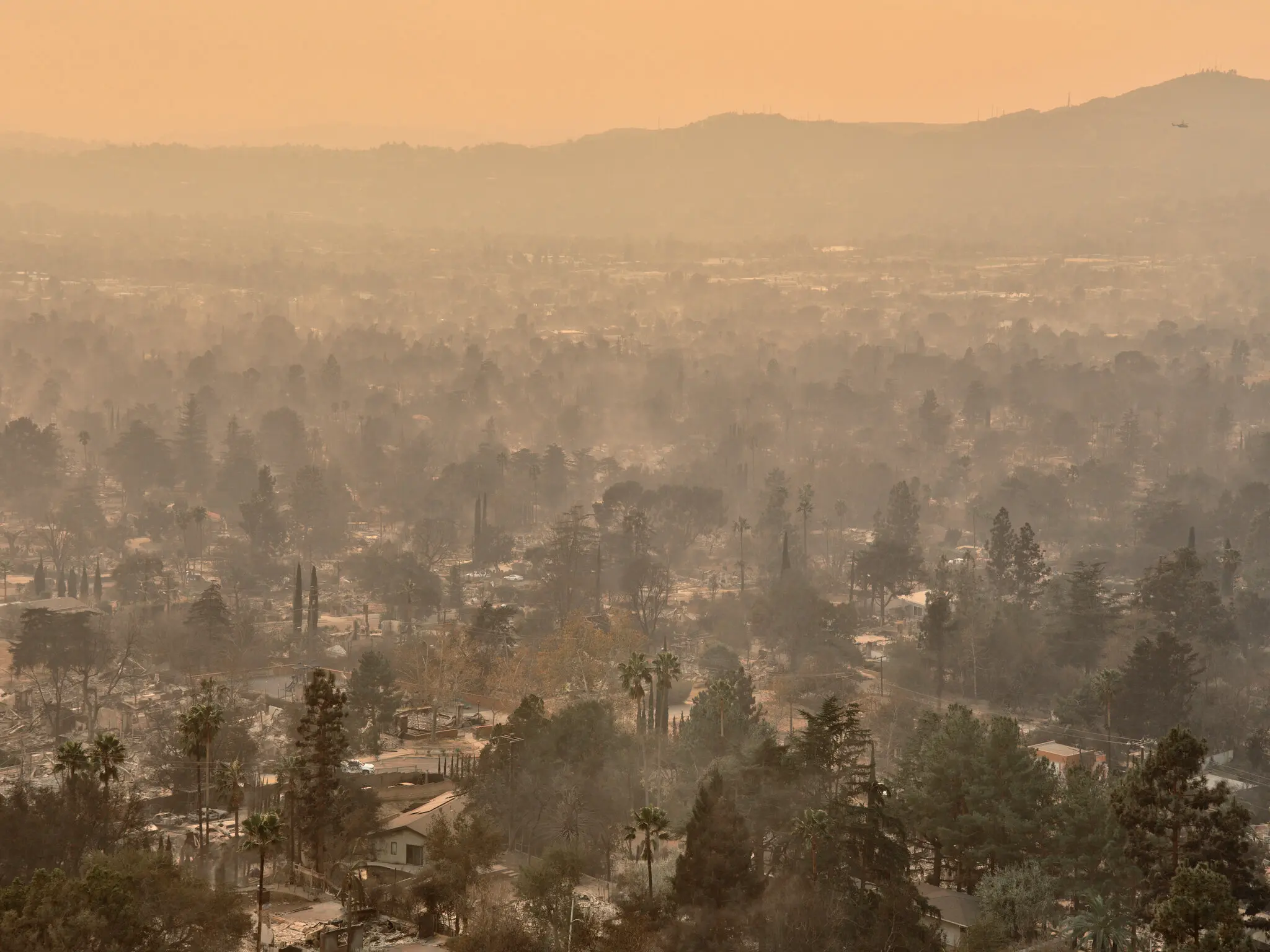
This blog post summarizes analyses involving the Eaton and Palisades Fires that took place in Los Angeles County during January 2025. It will specifically highlight the vegetation damage through false color imagery and explore internet availability of census blocks affected by the fires.
Complete code can be found in the corresponding Github repository.
Overview
The Eaton and Palisades fires occurred nearly simultaneously, inflicting both ecological and infrastructural damage on Los Angeles. Together, they destroyed more than 16,000 structures and displaced thousands of households. Understanding the specifics of the impact – such as which populations were most affected as well as the extent of vegetation damage – is vital for recovery efforts, as well as informing future fire safety and policy.
We overlay the fire perimeters onto to remote sensing and Environmental Justice Index (EJI) data to explore the patterns within. First, by using remote sensing data and assigning infrared bands to visible colors, we are able to highlight vegetation health, burn severity, and the extent of fire scars remnant after the fire. Second, clipping EJI census block data to the fire perimeters gives us a summary of the internet availability in each area. Internet availability is an important aspect of fire safety response as communities that lack availability to natural disaster information have less time to respond.
Analysis Highlights
- Using
xarrayand NetCDF data formats. Our primary dataset comes from the NASA/USGS Landsat program, and must be read in using thexarraypackage. - Plotting raster data as false color. The method combination
.plot.imshow, the argumentrobust, and selecting reflectance bands other than true color are important steps in the process. - Clipping raster data to a polygon.
geopandasfunctionality is used to accurately clip EJI data to our area of interest.
About the Data
Landsat/remote sensing
The dataset used in this analysis is a simplified collection of bands (red, green, blue, near-infrared and shortwave infrared) from the Landsat Collection 2 Level-2 atmospherically-corrected surface reflectance data, collected by the Landsat 8 satellite. Landsat data is provided by a series of Earth-observing satellites jointly managed by NASA and the U.S. Geological Survey (USGS), and stores a significant amount of reflectance information about the Earth’s surface.
The data was retrieved from the Microsoft Planetary Computer data catalogue catalogue and clipped to an area surrounding the fire perimeters by the EDS220 course team.
Palisades and Eaton fire perimeter
Palisades and Eaton fire perimeter data were sourced from LA County’s GIS hub. It contains dissolved fire boundaries for Eaton and Palisades fires. It is a public data set, published January 21, 2025 and last updated on February 26, 2025.
Environmental Justice Index (EJI)
EJI aims to summarize the cumulative impacts of environmental injustice by census tract in the United States. The index considers 36 different environmental, social, and health variables, with data from a variety of sources (including but not limited to the U.S. Census Bureau, the U.S. Environmental Protection Agency, USGS, and OpenStreetMap). The data in this analysis was sourced from the Centers for Disease Control and Prevention and Agency for Toxic Substances Disease Registry.
Analysis
Setup
False Color Image
Fire Perimeter Data Exploration
Before we utilize our fire perimeter datasets, we want to ensure that we have a general sense of what they contain and how they look.
# Read in data, using os to build file path and geopandas to read in .shp files (one for each fire)

# Eaton perimeter
fp = os.path.join('data','Eaton_Perimeter_20250121','Eaton_Perimeter_20250121.shp')
eaton_perimeter = gpd.read_file(fp)

# Palisades perimeter
fp = os.path.join('data','Palisades_Perimeter_20250121','Palisades_Perimeter_20250121.shp')
palisades_perimeter = gpd.read_file(fp)
Data loaded in successfully! Now we can plot them to visualize what we are working with.
Code
# Plot perimeter data to visualize its contents

# Initialize figure with two axes (so can plot each perimeter on a separate plot)
fig, ax = plt.subplots(nrows = 1, ncols = 2, figsize = (6,4))

# And the Palisades fire perimeter on the left //.boundary allows access to just the border of the polygon
palisades_perimeter.boundary.plot(ax = ax[0])

# Plot Eaton fire perimeter on the right
eaton_perimeter.boundary.plot(ax = ax[1])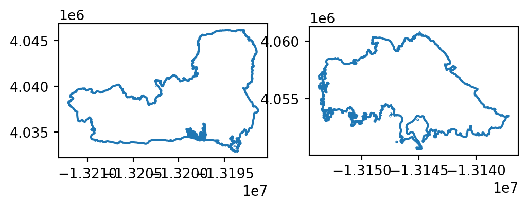
Now we have a preliminary understanding of what our datasets contain: complete geometries of each fire perimeter.
To find the CRS of the two datasets (which will inform how we treat them while plotting other data), we can explore the following.
# Use an assert statement to confirm the two data sets have the same CRS
assert eaton_perimeter.crs == palisades_perimeter.crs

# Since they match, what is the CRS of both fires?
print(f"The CRS of the fire perimeter data is {eaton_perimeter.crs}.")
The CRS of the fire perimeter data is EPSG:3857.Great! The two CRSs match, and we will keep this information in mind when we plot with our raster data.
Landsat (NetCDF) Data Import and Exploration
Similarly to our fire perimeter data, we want to read in our remote sensing data and take a look at its features, such as dimensions, variables, and attributes. We are using xarray in this case.
# Read in data, using os to build file path
fp = os.path.join('data', 'landsat8-2025-02-23-palisades-eaton.nc')

# Import landsat data using `xr.open_dataset()` from the xarray library
landsat = xr.open_dataset(fp, engine="netcdf4")
Let’s take a look at the xarray object itself.
landsat<xarray.Dataset> Size: 78MB
Dimensions: (y: 1418, x: 2742)
Coordinates:
* y (y) float64 11kB 3.799e+06 3.799e+06 ... 3.757e+06 3.757e+06
* x (x) float64 22kB 3.344e+05 3.344e+05 ... 4.166e+05 4.166e+05
time datetime64[ns] 8B ...
Data variables:
red (y, x) float32 16MB ...
green (y, x) float32 16MB ...
blue (y, x) float32 16MB ...
nir08 (y, x) float32 16MB ...
swir22 (y, x) float32 16MB ...
spatial_ref int64 8B ...From this output, we can see the five reflectance bands that our data has stored. We also see that there are three coordinates: x, y, and datetime. We now also know the size of our coordinates and the data type of each variable.
We can check the geographic information of our data using the rio accessor…
print('CRS: ', landsat.rio.crs)CRS: None… but get nothing back. This is because this data currently has no geographic information, as it is stored within the spatial_ref variable. We can restore it by doing the following.
# Access CRS through `spatial_ref` variable
# .crs_wkt specifies that our CRS was stored in the well-known text format
landsat_crs = landsat.spatial_ref.crs_wkt

# Recover and reassign geospatial info through .write_crs
landsat_geo = landsat.rio.write_crs(landsat_crs)

# Print new CRS info
print(f"The CRS of the landsat raster data is {landsat_geo.rio.crs}.")
The CRS of the landsat raster data is EPSG:32611.Success!
False Color Image
False color images use colors not found in visible light, such as infrared, which are assigned to different bands of the visible light spectrum (RGB). This helps us visualize phenomenom that can be observed with reflectance patterns, but not by the human eye.
Here, we create a false color image by plotting the short-wave infrared (swir22), near-infrared, and red variables (in that order). We do this because those three wavelengths are useful in determining vegetation health. Then, we can overlay our fire perimeters to explore differences between affected and untouched areas.
First, we want to make sure our geographic information matches.
# Changing fire perimeter data to the landsat CRS ; sourced from original exploration, where landsat_crs = 'epsg:32611'
eaton_perimeter = eaton_perimeter.to_crs(landsat_crs)
palisades_perimeter = palisades_perimeter.to_crs(landsat_crs)
Then, we can plot them all together.
Note:
imshow() is useful for raster data as it tells the “image to show”, and the argument robust = True indicates to only plot values from the 2nd to 98th percentile. This distinction helps to avoid outliers that are results of inaccurate or incorrect data (for example: extremely low or high values that correspond to cloud cover) which can skew the appearance of the image, sometimes inhibiting it from plotting at all.
Code
# Initialize figure with one axes
fig, ax = plt.subplots(figsize = (9,5))

# Plot false color raster image by selecting which bands we want to assign
landsat[['swir22', 'nir08', 'red']].to_array().plot.imshow(robust = True,
                                                           ax = ax)

# Plot the Eaton fire perimeter
eaton_perimeter.boundary.plot(ax = ax,
                              color = "red",
                              linewidth = 1.5,
                              label = "Fire Perimeter")             # Set label to create legend for fire perimeter

# Plot the Palisades fire perimeter
palisades_perimeter.boundary.plot(ax = ax,
                                  color = "red",
                                  linewidth = 1.5)

# Add labels to distinguish between Eaton and Palisades boundaries
# .set_bbox() creates background for text (for better visibility)
ax.text(x = 402400, y = 3779000, s = "Eaton", color = "black", fontsize = 8).set_bbox(dict(facecolor='white', alpha = 0.8, edgecolor = 'none'))
ax.text(x = 345000, y = 3775000, s = "Palisades", color = "black", fontsize = 8).set_bbox(dict(facecolor='white', alpha = 0.8, edgecolor = 'none'))

# Turn of x and y axis (are in meters, so don't tell give us a lot of information)
ax.axis('off')

# Plot title and description
plt.title("False Color Image of Los Angeles County, Post January 2025 Fires")
plt.figtext(x = 0.5, y = 0, s= "Description: False color imagery, overlayed with known fire perimeters, "
                                "is used to highlight the effects of wildfires on LA county." \
                                " By plotting short-wave infrared (swir22), near-infrared, and red reflectance bands," \
                                "we are able to observe the stark contrast in features such as vegetation health and burn severity throughout the area.",
            ha="center", fontsize=10, wrap=True)

# Add legend (for fire perimeters)
plt.legend()

plt.show()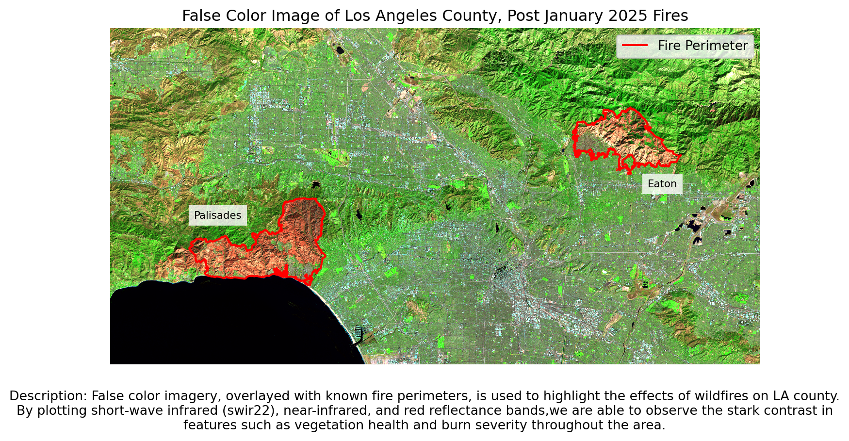
Now that we have a false color image with the fires highlighted, we can see the difference in vegetation health between areas within and outside the fire perimeters.
Internet Availability
Load in EJI data using geopandas.
eji = gpd.read_file("data/EJI_2024_California/EJI_2024_California.gdb")Polygon Clipping
The EJI dataset is a raster spanning all of California. To get it to only our area of interest (the fires), we can use the geopandas methods .sjoin() and .clip().
# Transform both perimeters to have CRSs matching that of the EJI data
palisades_perimeter = palisades_perimeter.to_crs(eji.crs)
eaton_perimeter = eaton_perimeter.to_crs(eji.crs)
First, we complete a spatial join of our EJI and fire perimeter data. The result is the EJI census tracts that intersect with the Palisades and Eaton fire perimeters.
Spatial Join:
# Inner join fire perimeter to CA census tracts
palisades_tracts = gpd.sjoin(eji, palisades_perimeter, how = "inner", predicate = "intersects")
eaton_tracts = gpd.sjoin(eji, eaton_perimeter, how = "inner", predicate = "intersects")
Through the order of our arguments, we told .sjoin() that we only want EJI that intersects with the fire perimeters. The argument “inner” specifies that we want to keep only the data that is shared between both EJI and the two fire perimeters.
We can visualization this in the following plot:
Code
# Initialize plot with two axes
ig, ax = plt.subplots(figsize=(9,5), nrows = 1, ncols = 2)

# Plot census tracts that intersect with the fire perimeter
palisades_tracts.plot(ax = ax[0])
# Plot palisades fire perimeter on top in red
palisades_perimeter.boundary.plot(ax = ax[0],
                       color = "red")

# Plot census tracts that intersect with fire perimeter
eaton_tracts.plot(ax = ax[1])
# Plot eaton fire perimeter on top in red
eaton_perimeter.boundary.plot(ax = ax[1],
                       color = "red")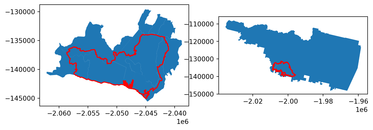
We only want the data that is fully within the fire perimeters, so additional steps must be taken.
One option to conduct a similar spatial join (using .sjoin()), but instead of the predicate = "intersects", specify predicate = "within". This distinction tells the method to only keep data that is wholly within our perimeters, instead of just intersecting.
In this analysis, however, we opt to use the geopandas .clip() method.
Clipping:
# First arg: what we want to clip; Second arg: what polygon we want to clip to
clipped_palisades = gpd.clip(eji, palisades_perimeter)
clipped_eaton = gpd.clip(eji, eaton_perimeter)
To ensure that our clipping was successful, we can plot our new clipped data with our fire perimeters.
Code
# Initialize plot with two axes, plot eaton and palisades on each
ig, ax = plt.subplots(figsize=(9,5), nrows = 1, ncols = 2)

## Palisades
# Plot clipped data
clipped_palisades.plot(ax = ax[0])
# Fire periemeter
palisades_perimeter.boundary.plot(ax = ax[0],
                       color = "red")

## Eaton
# Clipped data
clipped_eaton.plot(ax = ax[1])
# Fire perimeter
eaton_perimeter.boundary.plot(ax = ax[1],
                       color = "red")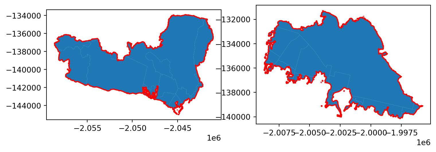
We have successfully extracted only the EJI/census data that is contained by our two fire perimeters!
Visualizing EJI Data
In plotting our EJI variable of interest within our fire perimeters, we have to select our variable of interest. In our case this is internet availability. Variable names for the EJI data can be found in its metadata.
# Specify internet availability information as variable of interest
eji_variable = 'E_NOINT'
We can take then plot our clipped eji datasets (clipped_eaton and clipped_palisades), and specify column = eji_variable to color each census block by socioeconomic information.
Code
# Initilaize figure
fig, (ax1, ax2) = plt.subplots(1, 2, figsize=(11, 5))

# Find common min/max for legend range
vmin = min(clipped_palisades['E_NOINT'].min(), clipped_eaton['E_NOINT'].min())
vmax = max(clipped_palisades['E_NOINT'].max(), clipped_eaton['E_NOINT'].max())

# Plot census tracts within Palisades perimeter
clipped_palisades.plot(
    column= eji_variable,
    vmin=vmin, vmax=vmax,
    legend=False,
    ax=ax1)

ax1.set_title('Palisades Fire')
ax1.axis('off')

# Plot census tracts within Eaton perimeter
clipped_eaton.plot(
    column=eji_variable,
    vmin=vmin, vmax=vmax,
    legend=False,
    ax=ax2)

ax2.set_title('Eaton Fire')
ax2.axis('off')

# Add overall title
fig.suptitle('Persons with No Internet - Fire Areas Comparison', fontsize = 16)

# Add shared colorbar at the bottom
sm = plt.cm.ScalarMappable( norm=plt.Normalize(vmin=vmin, vmax=vmax))
cbar_ax = fig.add_axes([0.25, 0.08, 0.5, 0.02])  # [left, bottom, width, height]
cbar = fig.colorbar(sm, cax=cbar_ax, orientation='horizontal')
cbar.set_label('Persons with No Internet (%)')

plt.show()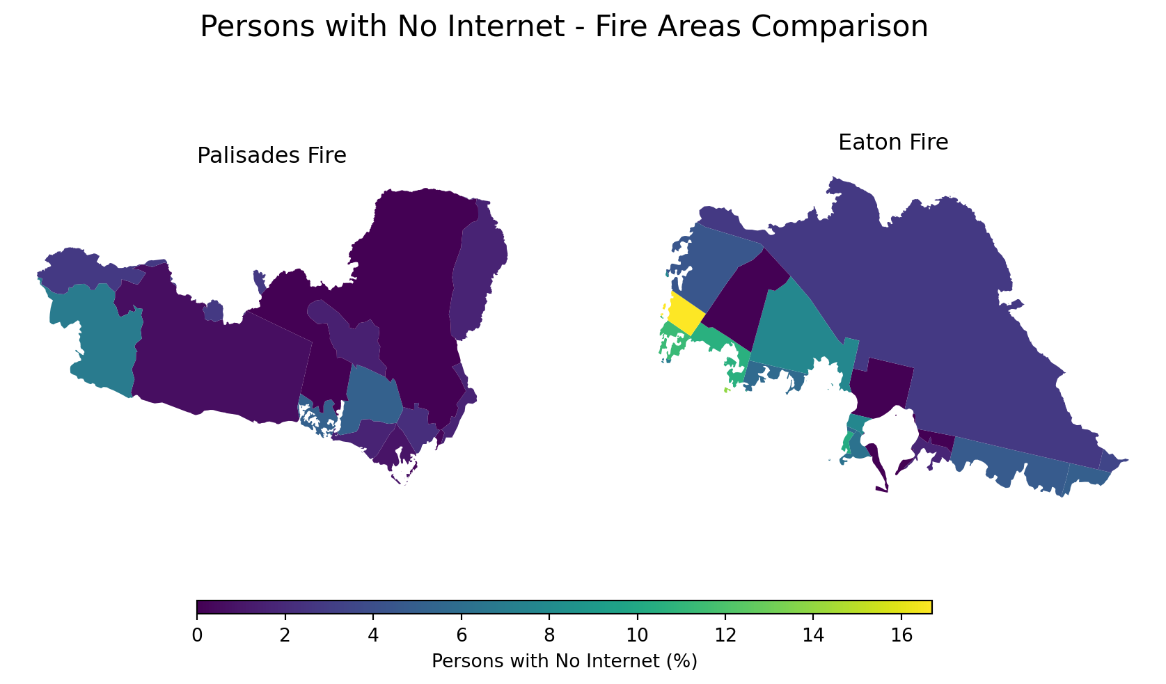
From this plot, we can see that there are few census tract with a significant percentage of individuals who do not have internet access. The left-most census tract of the Eaton fire – colored in yellow – is perhaps of concern.
We can ask the question, why is internet availability lower there than in the surrounding areas? And, how did that affect their response to the LA fires?
Conclusion
This blog post used Python libraries such as xarray and geopandas to perform spatial analyses related to the Los Angeles County fires of January 2025. The images produced revealed the intensity of vegetation damage on the affected area, as well as raised questions regarding resource access inequality in areas impacted by the fires.
Thank you for reading!
References
Centers for Disease Control and Prevention and Agency for Toxic Substances Disease Registry. (2024). Environmental Justice Index. Accessed November 21, 2025. https://atsdr.cdc.gov/place-health/php/eji/eji-data-download.html
Earth Resources Observation and Science (EROS) Center. (2020). Landsat 8–9 Operational Land Imager / Thermal Infrared Sensor Level-2, Collection 2 [Dataset]. U.S. Geological Survey. Accessed November 15, 2025. https://doi.org/10.5066/P9OGBGM6
Los Angeles County Enterprise GIS. (2025). Palisades and Eaton Dissolved Fire Perimeters [Dataset]. Los Angeles County. Accessed November 21, 2025. https://egis-lacounty.hub.arcgis.com/maps/ad51845ea5fb4eb483bc2a7c38b2370c/about
Phillips, S. (2025, February). The Palisades and Eaton Fires: Neighborhood Data and Potential Housing Market Effects. UCLA Lewis Center for Regional Policy Studies.